 Vastu Blueprint
Every field of practical knowledge works on the same underlying idea — spotting patterns. Astrology looks at repeating planetary patterns across lives. Numerology studies numbers and their consistent effects. Vastu Shastra examines how certain directions, layouts, and energies bring similar results across different properties. At the centre of all these systems is what I think of as the Law of Commonalities: when the same outcome keeps appearing under similar conditions, the things those situations share in common are worth studying carefully.
I apply this law not just to properties but to professional tools as well. And one of the most interesting applications I have found is the visiting card. A visiting card is small enough to fit in a shirt pocket — yet when designed with awareness, it quietly carries the practitioner's professional identity into every room it enters, every drawer it rests in, every moment it is picked up and read.
What a Visiting Card Is Actually For
Before applying any design principle to a visiting card, it helps to be honest about what the card is genuinely meant to do. Think of two neighbours who meet in a lift every morning and chat warmly. They do not exchange visiting cards. Why? Because visiting cards are not for casual social connection. Their single purpose is to create professional opportunities.
The flow is simple: card given — contact made — opportunity created — growth follows. The card does not create wealth directly. It opens the first door. Everything that follows depends on what the practitioner does once that door is open.
This is why, when I advise anyone on their visiting card design, the first question I ask is: which direction governs opportunities? In Vastu, the answer is the North. The North zone governs career growth, business development, financial prospects, and the arrival of new enquiries. Designing a card with the North zone in mind is therefore the single most important Vastu principle in professional branding.
The Three Zones That Matter on Any Card
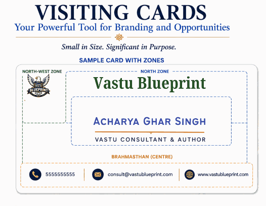
Think of a visiting card as a miniature Vastu Mandala — a small energetic grid with directional significance. Three zones deserve the most attention.
The North zone is the upper portion of the card when held in reading position. This is where professional identity and purpose belong — your designation, your area of practice, the nature of your work. Placing this information in the North zone energetically links your professional identity to the zone that governs incoming opportunity.
The Brahmasthan is the centre of the card. Just as the Brahmasthan of a building is the point that draws energy inward and distributes it outward, the centre of a card naturally draws the eye first and leaves the deepest impression. Your name or your primary brand identity belongs here. People may forget the details on a card, but they almost always remember what sat at the centre.
The North-West zone is the upper-left area of the card. The North-West governs communication, movement, and helpful connections — the very qualities that a logo or visual symbol is meant to activate. Placing brand symbols, professional logos, or distinctive visual identity elements in the North-West supports wider visibility and encourages the card to generate referrals and word-of-mouth connections over time.
Learning from Successful Professionals — The Law of Commonalities in Practice
When I began studying visiting cards of genuinely successful people across different fields — business leaders, lawyers, doctors, architects, consultants — I noticed the same patterns appearing consistently regardless of industry.
The name or primary brand identity almost always sits near the centre of the card. The professional designation is typically in the upper portion. Visual symbols and logos appear more often on the left side. And without exception, the cards of highly successful people are clean and simple. Warren Buffett's card is the clearest example — almost no decoration, no elaborate graphics, maximum clarity around the name and the designation. The personal brand dominates because nothing distracts from it.
This is not coincidence. It is the Law of Commonalities at work. When the same design choices appear repeatedly among people whose professional lives have flourished, those choices deserve serious attention. A consultant advising a client on their visiting card should study the cards of the most successful people in that client's specific field — not to copy blindly, but to understand what pattern of design has consistently supported success in that domain.
Colours — Match the Card to the Nature of the Work
Colours carry elemental and planetary energy. The right colour choice for a visiting card is not a matter of personal preference alone — it is a matter of matching the card's visual energy to the natural element and planetary ruler of the work it represents.
A knowledge-based practice — education, consulting, research, writing — is governed by Mercury. Mercury's directional colour is green, and the North zone's colour is blue. A card in soft blue and green tones carries clarity, communication, and steady growth — exactly the qualities a knowledge professional wants to project. It feels intelligent, trustworthy, and calm.
A food-related business — restaurants, sweet shops, catering, hospitality — is governed by the Fire and Earth elements. Warm shades of red, orange, and yellow combined with cream or off-white carry the inviting, nourishing energy that draws customers toward food. These are the colours that make a card feel welcoming and appetising rather than clinical or cool.
A healthcare or wellness practice is best served by white, soft blue, and gentle green — colours that communicate cleanliness, care, and healing. A legal practice benefits from navy, deep blue, or dark green — colours that convey authority and trustworthiness. A financial advisor's card works well in dark blue, gold, and white — the colours of Saturn's discipline combined with Earth's abundance.
The principle is always the same: let the colours reflect what the work genuinely does and who it genuinely serves.
Practical Guidelines for a Strong Professional Card
Drawing from both Vastu principles and the Law of Commonalities, here is the guidance I give to every professional who asks me about their visiting card.
Keep the design simple and uncluttered. A card that takes more than three seconds to read is a card that does not work. The viewer should know immediately who you are, what you do, and how to reach you. Everything beyond these three facts weakens the card rather than strengthening it.
Place your name or primary brand identity at the centre. Place your designation or professional focus in the upper portion. Place your logo or visual symbol toward the upper left. Keep contact details — phone, email, website — clearly readable, without competing for visual attention with the core identity elements.
Choose colours that match the element of your work, not the colours you personally find attractive. A card that reflects the nature of the profession signals alignment and authenticity before a single word has been spoken.
Finally — and this is something I always emphasise — remember what the card is for. It is not a display of design skill or personal taste. It is a professional door opener. Every choice made in its design should serve that single purpose: to make the right person want to reach out.
Small in Size, Significant in Purpose
A visiting card is the most portable Vastu tool a professional carries. It travels into rooms you have never entered, sits on desks you have never seen, and represents you in conversations you are not present for. Designed with awareness — with the right placement of name and designation, the right visual balance, and colours that carry the natural energy of the work — it becomes something more than a piece of paper with contact details.
It becomes a quiet, consistent ambassador for everything you do. Use it wisely.